Data Modelling in PowerBI
Welcome to the Microsoft PowerBI Certification Series! Discover the world of data analytics and business intelligence with our comprehensive series. Learn about Power BI, data analysis processes, roles in data management, and gain insights into using Power BI effectively.


Data Modelling in PowerBI
Microsoft Power BI is a powerful tool for data visualization and reporting, but to make the most of it, you need to follow a structured approach. In this blog, we will break down the essential steps for effective Power BI preparation.
Understanding Your Users’ Needs
Before diving into Power BI development, it’s crucial to have a clear understanding of what your report and dashboard users will ask. This insight will guide you in creating relevant and valuable reports.
Designing the Semantic Model
The semantic model is the backbone of your reports and dashboards. Careful design is necessary to ensure it supports your visualizations effectively. Optimal model design is key for good query performance and resource efficiency.
Connecting to Data
Start by connecting Power BI to your data sources. Whether it’s a database, Excel file, or cloud service, a robust connection is vital for accurate reporting.
Transforming and Preparing Data
Data often needs cleaning and transformation. Power BI offers powerful data transformation tools to help you shape your data into a usable format.
Adding DAX Calculations
Data Analysis Expressions (DAX) is the language of Power BI for creating custom calculations. Use DAX to define business logic, create custom measures, and add calculated columns to enhance your reports’ insights.
Development in Power BI Desktop
Power BI Desktop is the development environment where you build your model. Here, you create visuals, design layouts, and refine the user experience.
Publishing to Power BI Service
After completing your model in Power BI Desktop, you can publish it to the Power BI Service. This step allows you to share your reports and dashboards with others in your organization.
Schema Design in PowerBI
In the world of Power BI, star schema design is a game-changer. It’s a structure that optimizes data modeling, making your Power BI projects more efficient and user-friendly.
The Star Schema Basics:
- The central hub is the “fact table,” storing specific business events (e.g., sales orders).
- The points are “dimension tables,” describing entities like customers, products, or dates.
Fact Tables: The Core:
Fact tables store rows representing business events. For example, a sales fact table records sales orders and quantities. They grow over time and provide summarized data.
Dimension Tables: The Details:
Dimension tables describe business entities. Each has a unique key column and additional descriptive columns. For instance, a date dimension table contains one row per date.
Connecting the Dots:
Dimension tables connect to fact tables using one-to-many relationships. Filters applied to dimension columns affect the fact table. This design pattern is efficient. Avoid directly connecting fact tables.
Mastering star schema design elevates your Power BI game. It’s user-friendly and supercharges your analytics. Understand fact and dimension tables, their roles, and relationships. Your Power BI projects will shine with valuable insights.

Analytic Queries in Power BI: Unveiling Insights
Analytic queries are the backbone of Power BI’s data analysis process. They follow a three-phase approach: Filter, Group, and Summarize.
Filter:
- This phase narrows down the data you want to analyze.
- Filters can be applied to the entire report, specific pages, or individual visuals.
- Row-level security (RLS) enforces background filters for data security.
Group:
- Grouping organizes data into meaningful groups.
- While not always necessary, it’s essential for some analyses.
Summarize:
- The final step produces a single-value result.
- Commonly used to summarize numeric data using functions like sum or count.
- Custom measures in DAX allow for more complex summarization, like percentages.

Key Takeaways:
- Analytic queries are vital for extracting insights in Power BI.
- The process consists of filtering, grouping, and summarizing data.
- Filters target specific data, grouping organizes it, and summarization provides meaningful results.
- DAX expressions simplify the configuration of these queries.
Table Storage Modes
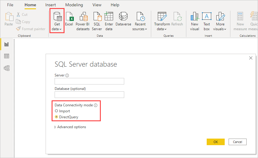
Each table in a Power BI model has a storage mode property: Import, DirectQuery, or Dual.
Import Model:
- Versatility: Import models handle all data source types, offering seamless integration.
- Functionality: They support advanced calculations and transformations using DAX and Power Query (M).
- Calculated Tables: Create custom tables with DAX formulas.
- Query Speed: Import models are lightning-fast for analytical queries, as data is stored in memory.
Direct Query:
- Large or Fast-Changing Data: DirectQuery models are great for handling big and frequently changing data, delivering near-real-time results without data import.
- Enforcing Security: They work well when your source database enforces security rules, reducing the need for replication.
- Data Security: DirectQuery is useful for organizations with strict data security policies, as it connects to on-premises sources without moving data.
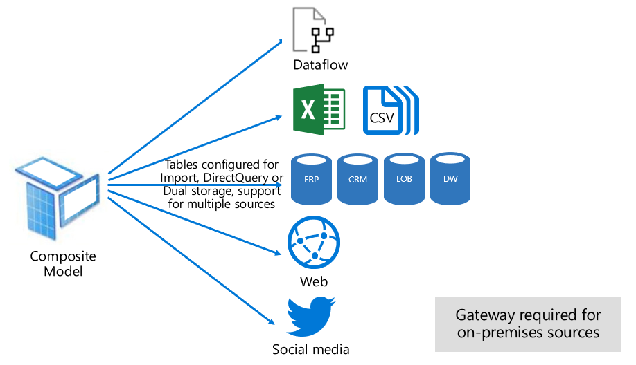
Composite Model:
- Flexibility: Composite models let you combine different data storage types for maximum flexibility.
- Performance Boost: They improve query performance by using cached data when possible.
- Model Extension: You can extend your model with new calculations when using DirectQuery tables from remote models.
Choosing the right model framework to optimize performance:
- Import Model: Best for most scenarios, offering flexibility and speed. Reduce data to load less.
- DirectQuery Model: Use with large data or real-time needs.
- Composite Model: Enhance DirectQuery with aggregation tables. Achieve real-time in import model. Extend datasets. Choose wisely for the best results in Power BI.
Creating Effective Semantic Models in Power BI for Better Reporting
In Power BI, developing a strong semantic model is crucial for simplifying data understanding and enhancing report creation. A well-crafted semantic model offers several benefits: quicker data exploration, easier aggregation construction, more accurate reports, reduced report writing time, and simpler future maintenance.
Key Principles for a Good Semantic Model:
- Simplicity: Opt for smaller models with fewer tables and columns. This not only boosts performance but also aids user comprehension.
- Effective Table Management: Limit the number of columns in each table to avoid overwhelming users. Ensure that the columns provided are necessary and manageable.
- Understanding Relationships: Recognize the importance of primary and foreign keys in establishing relationships between tables. These keys facilitate the connection of different data sets, forming a unified semantic model.
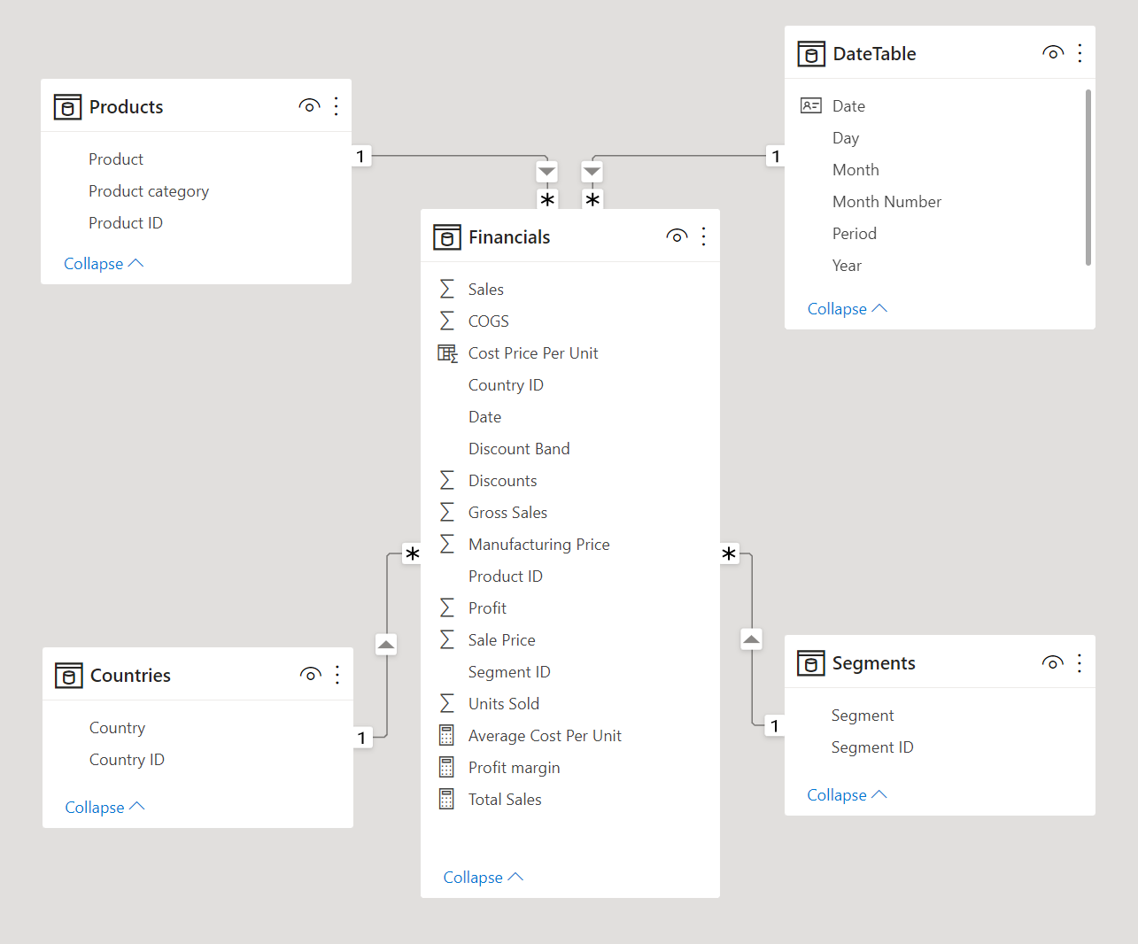
- Leveraging Star Schemas: Utilize star schemas, where each table is categorized as either a dimension or a fact table. Fact tables contain measurable data like sales or revenue, while dimension tables provide details for filtering and grouping the data in fact tables. This structure enhances performance and usability.
- Creating Visuals and Relationships: In Power BI, establishing clear relationships between tables is essential for building effective visuals. For instance, connecting the Employee and Sales tables via a common key (EmployeeID) allows for efficient data aggregation and visualization.
In summary, the cornerstone of efficient and organized reporting in Power BI lies in building a concise and well-structured semantic model. Time invested in designing these models and their relationships pays off in the ease of report creation and maintenance.
Power BI Model Preparation Steps
In your Power BI preparation, focus on these key steps for a simpler and more efficient data model:
-
Simplify Tables: Merge or append tables to reduce complexity. Ensure columns and tables are user-friendly.
-
Build Relationships: In the Model tab, establish and manage relationships between tables using tools like Manage Relationships and Autodetect.
-
Configure Properties: Use the Model view to edit table and column properties. This includes renaming, formatting dates, organizing, and setting visibility.
-
Bulk Updates: Utilize Power BI’s bulk update feature for efficient modifications across multiple tables and fields.
These steps will streamline your Power BI model, making it easier to navigate and more effective for reporting.
Creating a Common Date Table in Power BI
Power BI can automatically detect date columns, but sometimes, additional steps are necessary to format these dates appropriately. For instance, in a scenario where you’re creating reports for a Sales team, you might find different tables like Sales and Orders having their own date columns (e.g., ShipDate, OrderDate). To develop a comprehensive report on total sales and orders by year and month, a common date table that can be referenced by multiple tables is needed.
There are several methods to create a common date table in Power BI:
-
Source Data: If your database already has a date table, use it. These tables are often well-structured for identifying holidays, fiscal years, weekends, and weekdays.
-
DAX: Use DAX functions like CALENDAR() or CALENDARAUTO(). CALENDAR() creates a date range based on specified start and end dates. CALENDARAUTO() automatically determines the date range from your data. You can add additional columns for year, month, week, and day using DAX formulas.
-
Power Query: Utilize M-language in Power Query to define your date table. This involves creating a list of dates and converting it into a table. You can then add columns for year, month, week, and day.
After creating the table, integrate it into your semantic model, establish relationships with other tables, and mark it as the official date table in Power BI. This setup allows for effective time-based reporting and analysis, such as visualizing total sales and orders by month and year.
Navigating Hierarchies and Dimensions in Power BI
It’s essential to discuss the roles of dimension and fact tables in a star schema. Fact tables record events like sales orders, while dimension tables detail entities like products or time.
Key concepts include:
-
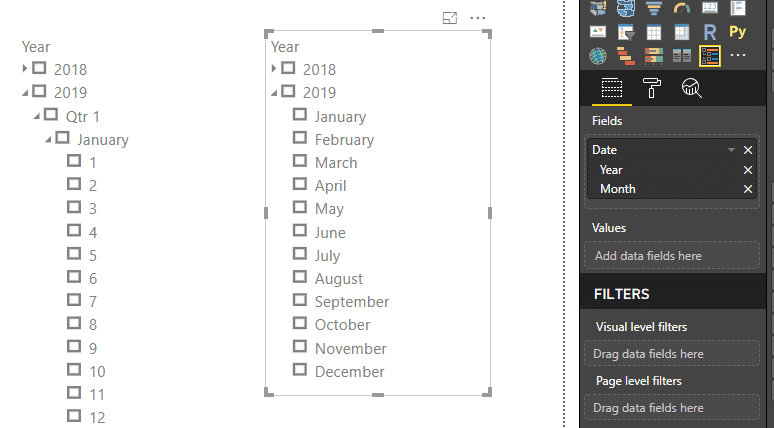
Hierarchies in Dimension Tables: Hierarchies, formed by natural data segments, help in drilling down into details. For example, dates can be segmented into years, months, weeks, and days. Power BI treats date types as hierarchies, enabling detailed analysis.
-
Creating Hierarchies: In Power BI, hierarchies can be manually created. For instance, in a Product table, a hierarchy can be established for categories and subcategories. This involves right-clicking a column in the Fields pane and selecting “New hierarchy,” then adding related columns to it.
-
Using Hierarchies in Visuals: These hierarchies can be used in visuals, like stacked bar charts, where you can drill down to see data at different levels (e.g., Category and Subcategory).
-
Parent-Child Hierarchies: This concept is essential in showing relationships in tables, like an Employee table indicating managers and their subordinates. Power BI doesn’t automatically show all hierarchy levels, so one needs to adjust settings or use DAX functions to “flatten” the hierarchy for detailed views.
-
Flattening Parent-Child Hierarchies: DAX functions like PATH() and PATHITEM() help in creating a text path between different hierarchy levels, effectively flattening it for a granular view.
-
Role-Playing Dimensions: These involve dimensions with multiple relationships with fact tables, allowing the same dimension to filter different data sets. It’s a more advanced topic requiring complex DAX functions and is crucial for multifaceted data analysis.
Understanding these concepts is vital for effectively organizing and analyzing data in Power BI, enabling more insightful business intelligence solutions.
Data Granularity in PowerBI
Data Granularity refers to the level of detail in your data. The more granular the data, the more detailed it is.
Understanding Data Granularity in Power BI:
-
Impact on Performance and Usability: The granularity of data significantly influences the performance and usability of Power BI reports. Choosing the right level of granularity is crucial.
-
Case Study - Refrigerated Trucks: Consider a company with 1,000 refrigerated trucks, each sending temperature data every few minutes via a Microsoft Azure IoT application. With such extensive data, it’s essential to find a balance in granularity to avoid overwhelming users with too much information.
-
Adjusting Granularity: In this scenario, you might import data using a daily average for each truck, reducing records to one per truck per day. This method balances the need for detailed data against the usability and performance of the report.
-
Granularity Options: Data granularity can vary - daily, weekly, monthly, or quarterly. The less granular the data, the faster the report refresh rate, but this may limit detailed analysis.
-
Building Relationships Between Tables: Granularity also impacts relationships between tables in Power BI. For example, if you’re integrating Sales and Budget tables with different time granularities (daily vs. monthly), you’ll need to reconcile these differences.
-
Practical Steps in Power BI: To reconcile differences in granularity, transform data in Power BI. For instance, concatenate Year and Month columns in tables to match their formats and establish relationships.
-
Creating Measures with DAX: Once granularity is aligned, use DAX measures to calculate values like Total Sales and Budget Amount. This helps in building effective visuals like matrixes showing sales and budget over time.
-
Balancing Granularity and User Needs: It’s crucial to negotiate the level of data granularity with users, considering their needs for detailed analysis against the performance of the reports.
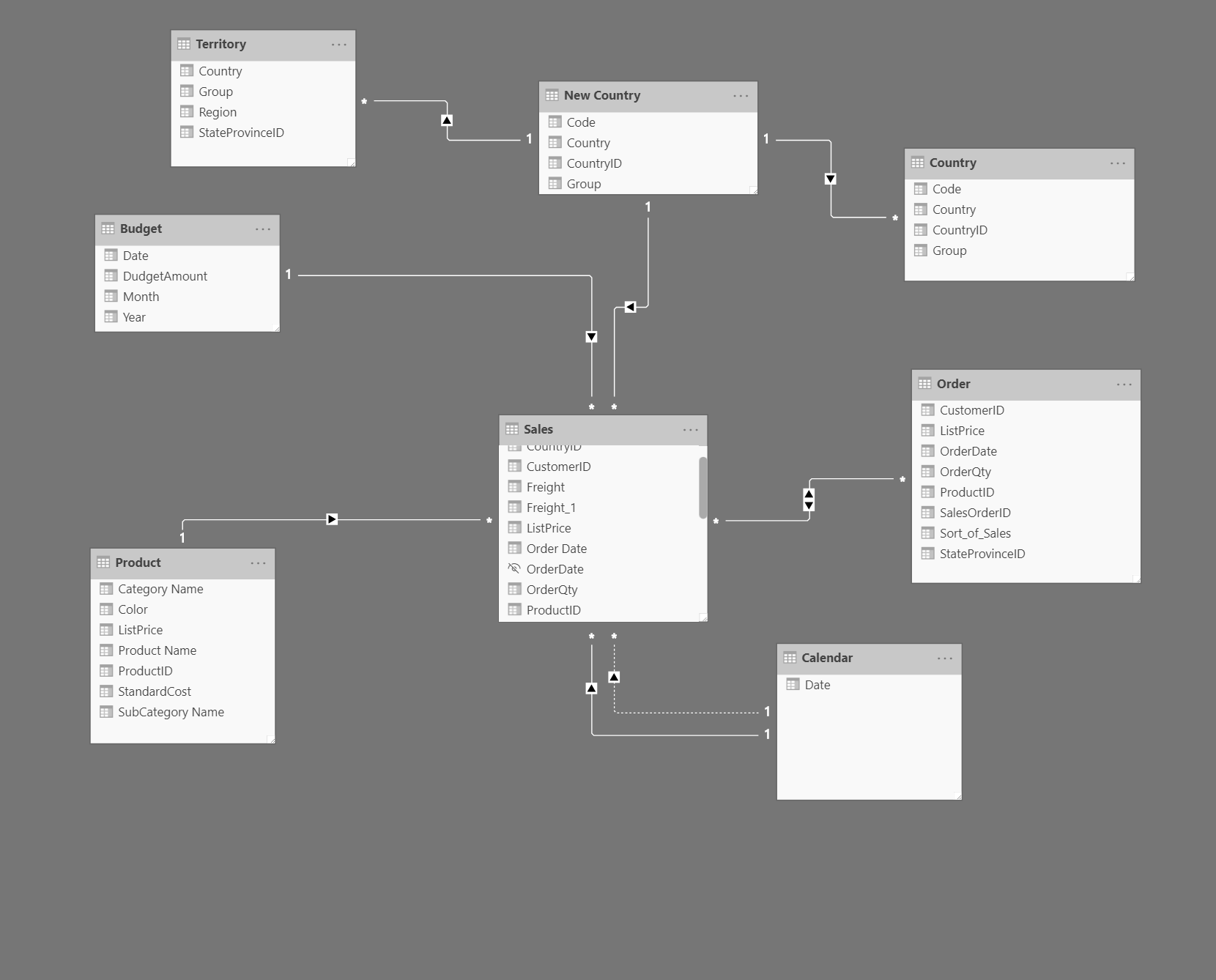
Relationships and Cardinality in Power BI
-
Auto-Detection of Relationships: Power BI automatically detects relationships in data by matching column names, but these can be manually edited using the Manage Relationships feature.
-
Types of Relationships:
- Many-to-One / One-to-Many (1:) / (:1): This is the most common relationship type in Power BI. It links many instances in one table to a unique instance in another. For example, linking many territories to one unique country.
- One-to-One (1:1): This relationship type connects one instance in a table to exactly one instance in another. It’s generally not recommended as it often indicates redundant data, suggesting that the tables should be merged.
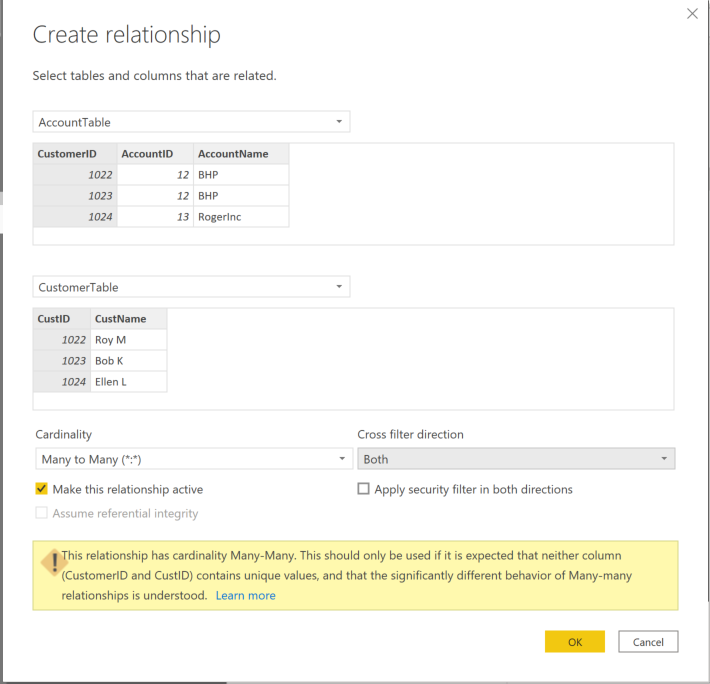
- Many-to-Many (M:M): In this type, many instances in one table relate to many in another. It’s not generally recommended due to the potential for ambiguity and complexity it introduces.
-
Cross-Filter Direction:
- Single Direction: One table filters another, but not vice versa. The filter direction follows the arrow in the relationship.
- Bi-Directional: Both tables can filter each other. While offering more flexibility, it can also lead to performance issues and unexpected results, especially in many-to-many relationships.
-
Cardinality and Cross-Filter Direction:
- In one-to-one relationships, bi-directional filtering is the only option.
- For many-to-many relationships, both single and bi-directional filtering are possible. However, bi-directional filtering in many-to-many relationships should be used cautiously due to the potential for ambiguous results and complexity.
-
Creating Many-to-Many Relationships: When necessary, such as in scenarios involving multiple customers per account (and vice versa), a many-to-many relationship can be established. However, Power BI will warn about the potential for unexpected results, especially when neither column involved has unique values.